If you're using Chrome, right-click the URL bar and check "Always show full URLs", so you can see the https:// prefix like it's 1999. This also fixes a variety of UX problems with editing URLs.
By the way, does anyone know of a good alternative to http://neverssl.com ? I had been using this for years, but now it supports SSL for some unfathomable reason.
"neverssl.com now supports ssl, as some browsers and sites automatically use https even when you don't type that in. You get a browser-cacheable page that still helps you get online by forcing a request that ... never uses ssl." --
https://twitter.com/NeverSSL/status/1456310362551164928
They're trying to solve the "how do log into this captive portal" problem, and they needed to make this change to handle that typing "neverssl.com" now often evaluates to "https://neverssl.com".
Wow. Unfathomable indeed; that action and that explanation make no sense to me, and they haven’t even updated the HTML served—it still makes the claim of “never SSL” they’ve reneged on.
I use HTTPS Only mode in Firefox. For a site like this, what I would expect is it to not accept connections on port 443, then my browser would issue a “Secure Site Not Available” error page, and I’d have to click the “Continue to HTTP Site” button to allow it to connect over HTTP for the rest of the session.
What happens is it just gets served over HTTPS—the one attempted HTTPS-on-apex-to-HTTP-on-subdomain redirect being translated to HTTPS-on-subdomain and the server shrugging and talking HTTPS on the subdomain without complaint—obviously undermining the whole point of the site.
To my knowledge, no browser configuration flat-out blocks cleartext HTTP; they’re all willing to compromise, and if you’re using neverssl.com you obviously intend to use that compromise. That’s why I say that both the action and the explanation make no sense to me; I cannot comprehend any way in which they actually help the site’s purpose, and the absurdity of it makes the site a laughing-stock.
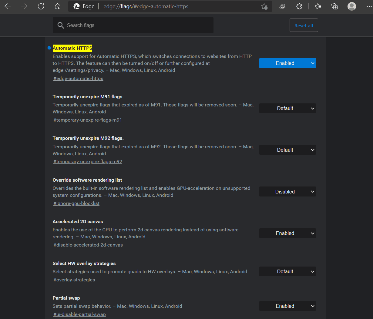
Cleartext HTTP is blocked for users on Microsoft Edge with "Automatically switch to more secure connections with Automatic HTTPS" turned on via corporate policy - which means they can't turn it off to get around the "feature".
There's also this chrome extension which can be configured by Corporate IT to disable HTTP and then they can also prevent disabling the extension.
Depending on what you're trying to do one of the "captive" ping urls works eg http://captive.apple.com
This is the url that apple devices ping to get the login box up for things like hotel wifi. There's a mozilla one also which is http://detectportal.firefox.com/canonical.html [1] , but that returns a redirect which may or may not work for your use case.
My latest annoyance with the Chrome URL bar is when certain things autofill (it might be bookmarks, but I think I see it in other frequently-visited addressed too), instead of it populating with the full URL so I can edit it, it just pops up as a piece of text to the right of where I'm typing, so I can see the URL that will fill if I hit enter but I can't edit it. It just started doing this a few months ago maybe?
Firefox on Android does this and it drives me nuts. It also means that all of the search entries are now useless as it auto-populates something and excludes what would've been reasonable hits. I'm constantly deleting that content so I can select something else.
Me too. Visiting the aforementioned URL is the only way I can consistently get captive portal login WiFi networks to work on my Mac. Amazing how busted this experience is...
Edit: I'm running Chrome OS 113 beta. Maybe they changed something recently, to automatically use HTTPS unless prohibited by the server? This also happens in Guest mode with no extensions.
In (50%) of Beta, Chrome attempts HTTPS and silently falls back to HTTP on all HTTP links. We're still poking around with opt-outs, currently if you allow insecure content via Page Info / Site Controls, we stop upgrades.
If you're open to feedback: I'm not strictly opposed to that behavior, but it seems like a reasonable compromise to not do that for URLs explicitly entered in the Omnibox. It seems like that will provide the transport upgrade effect we want, without breaking some of the workflows mentioned in this thread.
There are tons of sites where http and https are different content; for example the https might be an admin interface, or the IP could have multiple domains but only a couple of them support https, or the vhosts could be very misconfigured. The HSTS and other browser things that force https often do not allow any way to get around this. I often have to resort to creating a new browser profile from scratch and trying hard to avoid https when loading the page. So please allow some way to deal with this sort of issue, for technical folks at least.
Edit: if you search for "forget HSTS", you will see how hard it is to avoid this on some browsers.
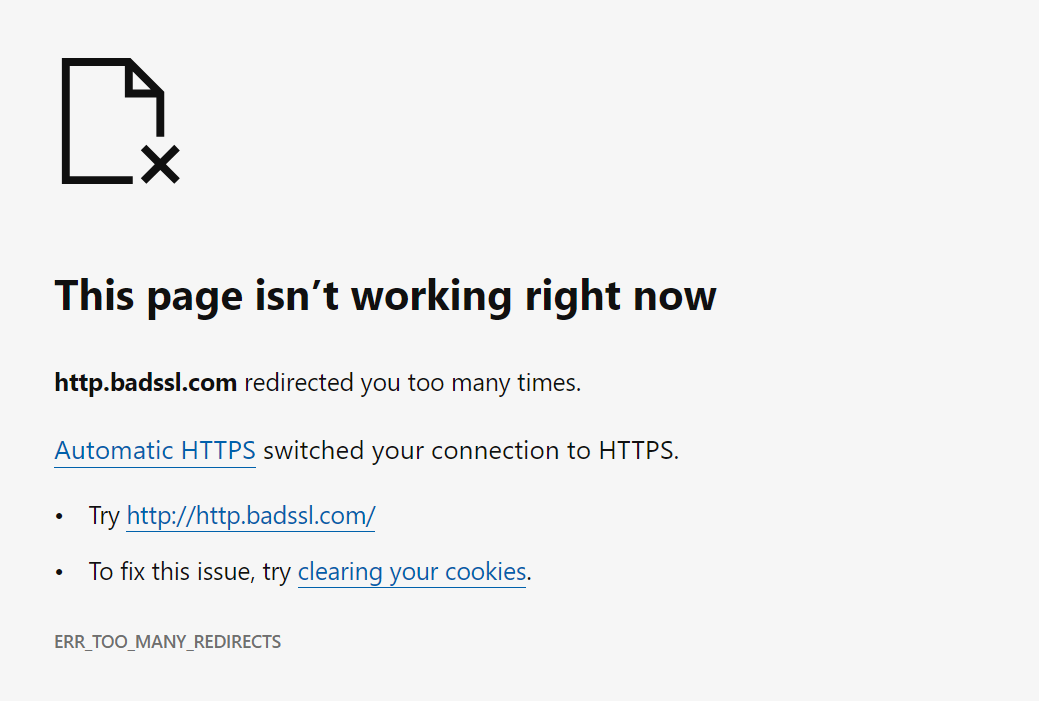
Somewhere in the past six months, on a page where we have to force users to HTTP, Chrome on Android has broken about 90% of the time with "too many redirects" and no way to even type "http://" into the URL bar without Chrome changing it. Finally had to just give users a raw IP address. I would love if your team could fix this or provide some opt-out.
For context, each of the retail locations of our company runs its own local MAMP server that serves a web app used all day by the employees on their tablets. It's accessible only on the LAN. Rather than have every employee need to know or type the local IP address for these (which change sometimes), we serve a centralized web page at http://ourcompany.com/employeeApp that just keeps a live list of the local (192.x.x.x) IP addresses harvested from each server in each location, and opens a connection to the local server in an iFrame. Because of what's now a hard ban on loading insecure HTTP content within an HTTPS page, we must serve that central iFrame wrapper page over HTTP. Unfortunately, we now need to give Chrome users a raw IP address for ourcompany.com, to avoid them being redirected infinitely to HTTPS and back.
[edit] I should add that the oddest thing is that it doesn't always overflow with redirects, and on a new device it often is able to go to the HTTP site. But once someone does type https:// or leave out the http:// by mistake, no level of cache clearing seems to remove Chrome's insistence on trying to force HTTPS on that page forever afterwards.
[edit2] The rationale for not setting up local DNS and SSL is that these servers are on all kinds of different local networks in stores around the country, are switched on and off by non-technical managers onsite, and I'm the author of the web app and the only tech support for it. It needs to be as simple as possible so that I'm not spending all my time tunneling into those servers, walking them through router problems and stuff like that.
Why not use Talescale / ZeroTier / etc to get those local boxes connected together into a single virtual overlay network with that gateway (which, from the client site's perspective, is basically just "install app, paste pairing token", and is zero maintenance from then on); and then make your web iframe "gateway" discover these devices that are now on its network, and act as an actual request-proxying gateway for them?
This is similar (though simpler!) to how e.g. Plex's "watch from anywhere" cloud integration works. Your local plex-server install starts a (plaintext HTTP, Bearer-auth) HTTP server on some uPnP port on your local network; derives a public URL for that server via TURN/STUN; connects to Plex's cloud service, and registers that URL to your Plex account. Then, when you visit https://app.plex.tv/ from any device, the plex webapp talks to the backend of their cloud service; and that cloud backend takes your HTTPS request payload, and makes equivalent plaintext-HTTP requests to the registered Plex server on your local network.
TBH, this system has been in production since 2016, and the stores essentially can't operate with any downtime... I dispatch updates that are auto-downloaded, and when one of them misfires and I have to spend an hour on remote access, that store's business comes to a halt causing a huge disruption as they transition to paper notes and whiteboards. (The software lets employees track and take ownership of the checkin/checkout and movement of dogs around 30k sqft petcare facilities, each with hundreds of dogs per day... so just the amount of barking when I'm on the phone with these places makes it hilariously difficult to guide people through tech support).
I looked a little bit at Tailscale but assumed it would be too complex for the store employees to manage and would require a lot of hands-on maintenance, and a store-by-store hand holding process which requires scheduling each of them weeks in advance. As it is, the system is secure (local wifi only accessible to employees) and runs even if the store's internet connection goes fully offline... so... I think I'll take your tip and look at it again... the plex model is essentially what I was going for... but I'd be reticent to add any other layers of complexity or anything that could cause downtime.
Interesting. You mean Chrome wouldn't do this if there was no ssl on the whole subdomain? Might be worth trying.
Redirecting isn't really a great option because the wrapper app is usually saved
as a shortcut to the tablet homescreens to run in full screen mode... saving the redirected url would break more frequently. Also the wrapper iframe polls lots of known local addresses and sees which one loads.
A quick skim of what I think is the relevant file[1] in the chrome source suggests that would work. So worth a shot. If you can deploy enterprise chrome settings to the tablets that's also apparently an option.
Here's what I'm assuming is the relevant bugtracker entry for the implementation [2].
> By the way, does anyone know of a good alternative to http://neverssl.com ? I had been using this for years, but now it supports SSL for some unfathomable reason.
For forever I used yahoo.com to login to a captive portal. I don't know why, but for some reason it worked for me when typing google.com, etc didn't work. Somehow I figured that out and stuck to it. I haven't done it in a while, though, not sure if it would still work.
I always figured this was due to DNS caching: if you got a domain you never visit, it has to actually fetch it and that triggers the captive portal login .
I believe that's the point! (Would probably be more user-friendly if it sent a RST instead of silently dropping the connection and letting it time out.)
Thank you. I searched and found a similar option in Safari settings but it doesn’t permanently show the protocol prefix. It also gets overridden on google searches where it just shows your search terms, not the URL.
Edit: I'm running Chrome OS 113 beta. Maybe they changed something recently, to automatically use HTTPS unless prohibited by the server? This also happens in Guest mode with no extensions.
It is your browser doing that redirect, not the side.
The http://neverssl.com ends up on an http page, and so does https://neverssl.com. But that final page (the one you posted) does not itself redirect from https to http.
neverssl seems to be doing some weird thing where it uses Javascript to load a non-https link rather than an actual redirect. I can't for the life of me guess why that would be better than a simple 301 redirect.
The primary goal of NeverSSL is to be useful on networks with captive portals that intercept HTTP and block HTTPS (until you have signed in). The JavaScript redirect is at least browser cacheable, whereas a 301 redirect sent via HTTPS would be useless in that scenario as it would fail to load.
Yes, sorry: the other piece is that NeverSSL wants to redirect to a new domain every time you visit to ensure that the page that you was actually loaded from the network and not from a cache, which a cached 301 to a fixed address wouldn't accomplish.
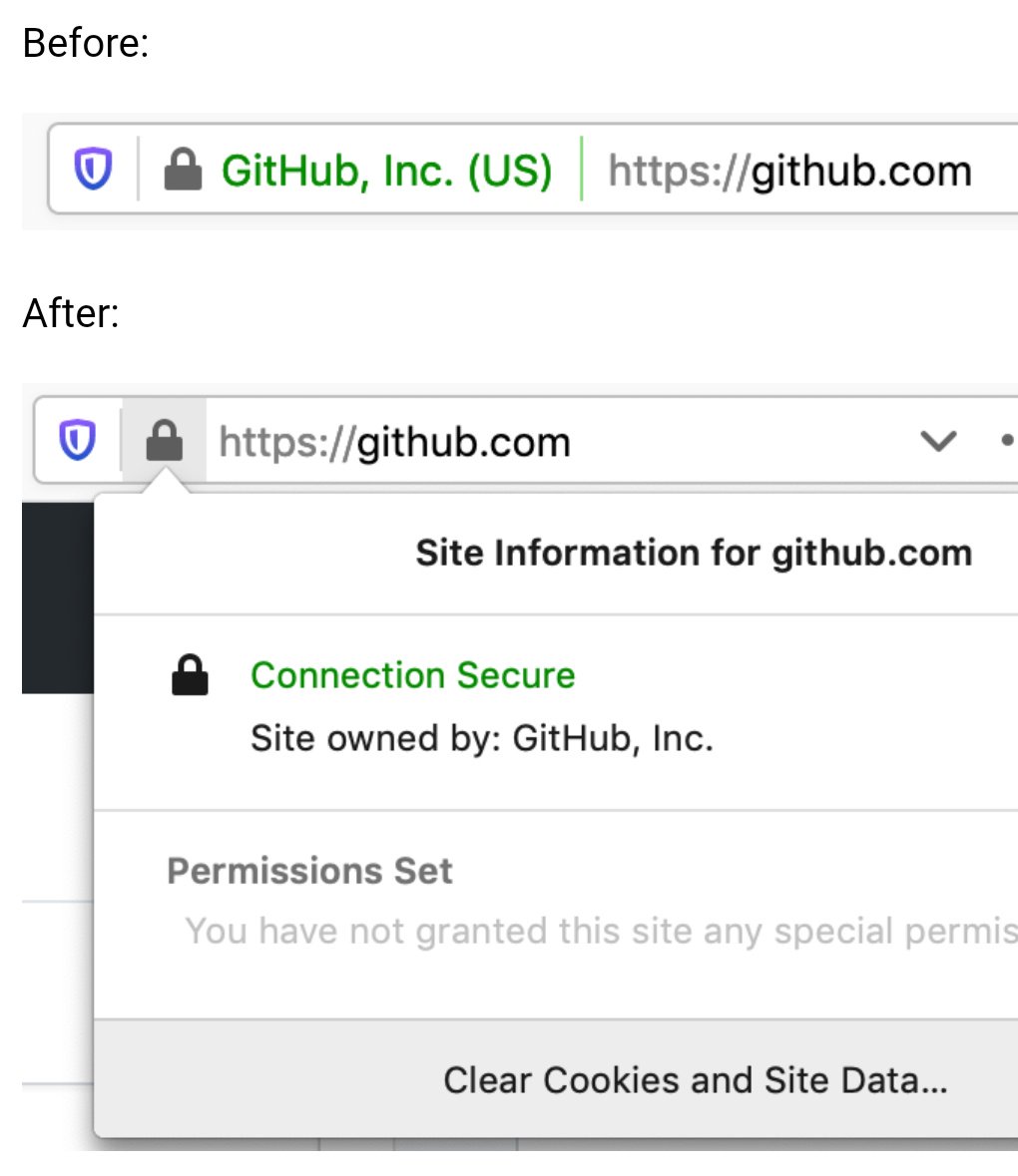
Reading through this it's making a lot of sense, the lock icon was added to convey that the 'connection is secure', while making the assumption that the user understood it's talking about the transport layer behind the scenes. Of course, most users cannot be expected to know that kind of detail, so they would associate it with the thing in front of their eyes, the website itself.
I am sticking to Firefox but as changes go, this wouldn't be a terrible one for non-Chrome browsers to converge upon. I don't think it's a good idea to hide the option away entirely though; a lack of available information and options for a user on a platform can often lead to the platform itself deciding it needs to become the arbiter of information, but I assume the iOS limitation is Apple's usual user-hostile behaviour.
When we were hosting custom websites for various university departments on the cheap, at this point it was difficult to do HTTPS on a site that shared IPs (which I gather has been corrected). One group insisted on it, despite that their form results, which weren't exactly secret squirrel knowledge, got stuffed into plain ole SMTP emails. I explained this carefully.
"But it has a LOCK on it ..." It was impossible to get them to understand that SSL only protected one part of the movement of data. All they got was LOCK.
So, yes, I agree that the lock offers a kind of false sense of security to people who will latch onto that symbol even as the people providing the hosting tell them otherwise.
Indeed. In two different directions, even. First, a server can send a certificate with a large number of domain names in a field called "Subject Alternate Name" (SAN). If a server host a small number of static names, that's an easy solution.
Second, the client can use a TLS extension called "Server Name Indication" (SNI) to tell the server what name it's attempting to connect to. This is more recent than the SAN approach, and allows a single host to work for truly ridiculous sets of different names, even changing them dynamically.
while making the assumption that the user understood it's talking about the transport layer behind the scenes
I remember using an early (90s?) browser that explicitly said "Secured Connection" in the status bar with an icon that featured a depiction of a network cable. I don't remember the details, but I think that may have been in the early days of SSL.
imo it's the use of the word "secured" at all that's the problem, not the context to which it's applied. "Secured" can mean many things to many people, whereas "Encrypted" is much more descriptive as to what's actually happening and much less subject to interpretation.
The lock icon is tappable in other iOS browsers (Firefox, Brave, DDG, the list goes on). Chrome chooses to put site settings and SSL info in a different menu in the iOS version. I'm not sure which iOS platform limitation you're referring to.
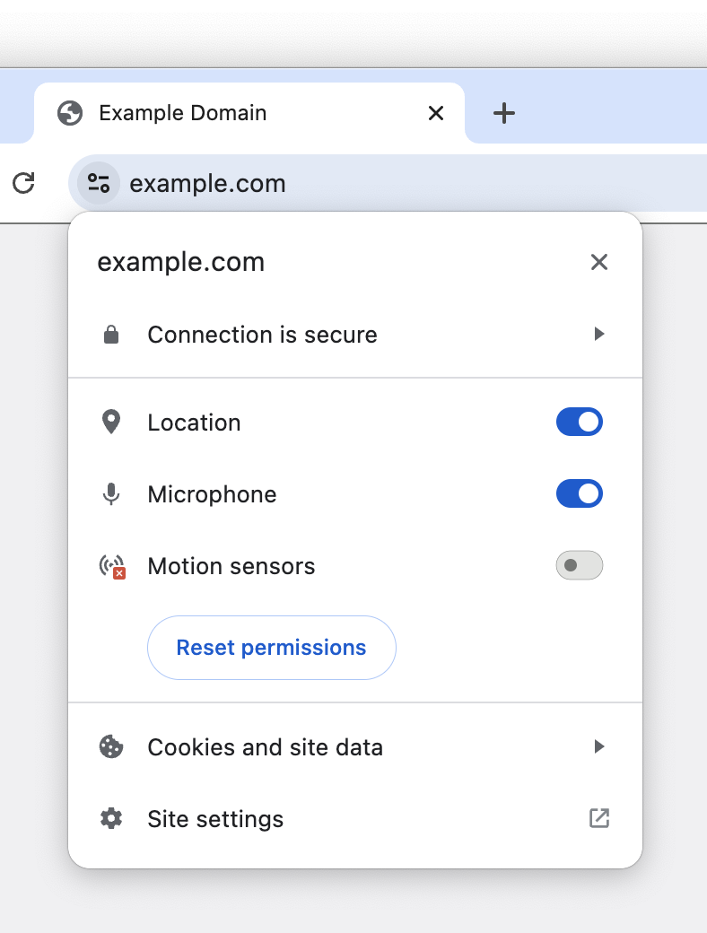
I approve of getting rid of the lock icon, showing only a broken lock for HTTP and no lock for HTTPS. It's always been weird to have site permissions settings revealed by clicking that lock.
But the replacement icon looks really strange to me. They're calling it a "tune icon," but I've never seen a tune icon like this, with just two circles and two lines. Looks weird. I'm surprised that it fared well in the experiment.
I would prefer it if they'd use a gear icon, which is normally used for settings like this. You can see a gear icon at the bottom of the tune menu for "Site settings," which makes it all the weirder that they're using a tune icon in the URL bar and a gear icon in the menu for site settings.
This icon is gaining traction fast. I've seen it a lot over the past few years. "Tuning" and "adjusting" is a slightly more specific concept than "settings". I think users associate the "settings" gear with whole-app settings, or "technical"/"system" settings, and it might be something they're loathe to click on because that's typically a large forest of things they don't care about or understand.
Firefox currently uses the same icon to configure site permissions (microphone, location, etc). However, it is only displayed if you have granted permissions. You can see it here:
I hate skeuomorphism when it's used wantonly, beyond the purpose of communicating how the UI works. Like that first version of the Apple Podcasts app that had a reel-to-reel animation¹, for example.
But icons... it's like the definition of the term.
> I forget whether it's cool or not this week.
I think it might be trending upward again. We all hated it in 2012, then the pendulum swung so far toward "flat design" that I (we?) would love to have too much of it again, if the alternative is not enough of it.
EDIT: Just thought about it some more and realized some icons are good abstractions of a non-physical thing. Play, Pause, and the rest of audio controls, for example. And of course Back and Refresh are just arrows.
But for something like "settings", or "info", you're going to have to draw some sort of picture for that. Gears and lists of sliders are two already-recognizable things that people know means "guts of the machine" and "control console panel thing".
The download/,upload ones. For extra points, they're also an English-specific visual pun. I can't think of a language-neutral version, though, unfortunately.
(Was also going to mention play/pause/stop, power, and standby, but you edited those in already. Still throwing this out there in case anyone knows a solution to the download problem.)
i think it's a fairly recognizable and standard icon, i've definitely seen it used for this sort of thing before. i've never heard it called a "tune icon" before but the name ultimately doesn't matter much
For my masters thesis, I proposed replacing the security indicator with a risk indicator: "After HTTPS: Indicating Risk Instead of Security" - https://scholarsarchive.byu.edu/etd/7403/
Turns out there are lots of localized, privacy-preserving cues you can observe to determine whether a user may be at some level of risk, that doesn't involve a centralized blocklist or a boolean answer; and users really appreciated the "heads up".
I think a control panel like this is a good step forward after ubiquitous HTTPS. I also think user agents can do more to protect and warn users in ways that are less easily spoofed by malicious sites. Looking forward to seeing future developments!
Microsoft Edge already does that. They show a quite prominent "Not secure" sign with an exclamation mark instead of the regular hollowed out (aka very indistinguishable) lock icon when the connection isn't trusted HTTPS.
I'm glad they continued the "An Update on X" = "X is getting axed" tradition at google. It's one of the few constants. Maybe they even have a UX guideline about it by now :D
PS: I'm not writing this out of spite, btw. It just came to my mind when I saw the title and I was surprised I was right
While I buy the reasoning that consumers simply ignore them, EV indicators would be really useful in a corporate setting to mitigate phishing attempts against employees. It’s much easier to train employees to “look for your company’s name in the green bar” before they sign into a site, than to understand how domains work and why login.yourcompany.com is OK but login-yourcompany.com isn’t.
Does anyone know if it’s possible to restore EV indicators in Chrome via MDM software or similar? Does anyone work at a company that does this?
> EV indicators would be really useful in a corporate setting to mitigate phishing attempts against employees.
Our company puts a big red banner on the top of all emails that come from an external source or don't have DMARC/SPF/DKIM/other security protections. Literally nobody ever checks the banner. It has no effect on phishing click rates. People do not read, or think. They just look for wherever it is expected for them to click something/fill something out, or just click random things to see what something might be.
The only thing that has marginally improved click rates is when we either gamify it, or put all external mails in an external mail folder marked NOT SAFE.
If you had a tornado siren go off every 20 minutes every single day of the year, how long before you stopped ignoring the siren? How surprised would you be when a tornado hit 2 year later?
"This product causes cancer" is ineffective when the warning is plastered on everything. Same goes for warning in computer systems.
San Francisco had a tsunami warning siren that was sound tested every Tuesday at 12pm for 30 seconds. It was fun!
It needed repairs so they dumped it. Few weeks later there was the 1st tsunami warning in ages but it went thru telephone since they dismantled their warning siren.
I always felt like it sounded like it was saying "noooooooooooooooooooooooooooooon on a Tuesday" to me. Lunch time.
Also always felt like around noon on Tuesdays, we were completely vulnerable; if anything were to happen I would have heard the siren, and wandered outside looking for grub.
There is a subset of San Franciscans that do not hear the siren, too. On a pretty common basis we'd discover someone in the office who had "never heard the siren", somehow. I'm not exactly sure how. It's easily audible inside in the FiDi, and it was audible in the North Beach when I worked there.
At my doorslam job, they hired a Director of Engineering Architecture or whatever title. He had a strong background in security, they said. Yeah well turns out his background was he led the offshore team that built an anti-virus company's .mobi website for 9 years. 1st hour of 1st day, he clicked the anti-phishing test "Click here to update your drivers" phishing email.
> EV indicators would be really useful in a corporate setting to mitigate phishing attempts against employees
I believe that kind of "negative awareness", the awareness that need you to keep checking if something has disappeared constantly doesn't work well in practice. You naturally develop blindness to that element, and therefore to its absence too.
Long ago I was reading someone registered corp in some other jurisdiction with the same company name which he wanted to impersonate with EV cert. And succeeded.
So what are you proposing is of questionable value.
That researcher was Ian Carroll, who created a new "Stripe, Inc" company in Kentucky, a clone of the one registered in Delaware, and was therefore able to get an EV certificate issued for his new company that looked very similar to one issued for the Delaware company.
His original research site appears to no longer be online (https://stripe.ian.sh/), but you can read more about it in these articles:
> The new icon is scheduled to launch in Chrome 117, which releases in early September 2023, as part of a general design refresh for desktop platforms.
I downloaded Chrome Canary to take a look at this "general design refresh" and... sigh.
The new browser UI is now 10 pixels taller than the old one.
I realize 10 pixels isn't a lot. But it's also not noting—it's half the height of the top bar on Hacker News. And this is after Google already made their UI much taller in their last refresh. If you make the UI take up more and more space with each redesign, it adds up.
Yes, I have a bigger monitor today than I once did. But I bought that monitor so I'd have more space for actual content, not the browser UI.
Remember how Google chose the name "Google Chrome" because it was designed to have a minimal UI that gets out of your way and lets you focus on page content?
> We think the tune icon [...] is more obviously clickable.
Yeah, because they made two changes and made it look like a button by modifying the surrounding area as well as changing the icon itself. The lock icon would also be more obviously clickable if it had the same changes in its surrounding area. How ridiculous of a comparison to make while changing two things.
It is not just about pixels... The line-height of the text in the address bar simply feels wrong to me. We now have more spaces but smaller, harder to see text. Feels like going backwards for me. Reminds me of the new Steam download UI, the elements are larger while the download speed is much harder to discrern. I rememember lying on bed checking on the game download speed in my high school years, now I have to get real close to see the current speed.
The rest of the "refresh" actually seems not unacceptably bad.
Some 'designers' just blatantly waste advanced technology and screen real estate. Like I finally built a PC that can open right-click menus in an instant wihout having to watch the spinner, and then windows 11 decided that having (unskippable!) transitions to open menus is a good idea. I went out of my way to make sure I have the lowest-latency mouse and monitor, and websites use these custom css scrollbars that have nearly 2 frames of more latency that the system one, also dragging windows in and out of Stage Manager make your mouse have massive latency for a while.
I am at least happy with macOS though, at least the line-height is not going wild. Seems Apple have some of their soul left, though they may be lost soon. Even just being a novice macOS user I can immediately tell whether any animation is done pre or post 2020.
It's been the trend for the past decade or so to use as little of the available rendering power as possible.
32-bit color? Naw, we're going two tone: Black and white.
8k screen resolution? Naw, we can't waste precious screen real estate on such frivolous things like borders and shading.
240Hz screens? Naw, we can't waste precious processor cycles and power on frivolous animations.
As for fonts, I get the impression that designers behind it are all in their 20s, maybe even fresh out of their late 10s. One's eyesight is usually still top notch in that age range, I know mine was; and I too dabbled in font sizes for ants because they looked cooler.
But I'm in my 30s now, and I can't stand tiny fonts anymore. My eyes aren't what they used to be, and designers by either their ignorance or naivety can't seem to respect the fact that people fucking age. I don't entirely blame them, I was that ignorant and naive bastard too once upon a time; I've grown wiser with age.
Newer/younger designers really ought to be shown how their seniors use their designs, it'll be an eye opening (pun intended) learning moment for the ones who were just naive. The ignorant ones probably can't be helped, but who knows.
This settings/configure/adjust icon seems to be in the middle of a transition between abstract and universal. Something like a magnifying glass didn't need any transition period because humans already associate it with "searching" from fiction. Other icons required reinforcement to learn (e.g. the share icon - or, even more well learned, the pause icon). One of the downsides of the modern hyper-focus on metrics in UI is that it dictates that iconography already be intuitive. Sometimes we need to ignore this rule in order to teach users a new icon, which then helps us improve interfaces by communicating more without words.
I've got to say, "tune" is such a weird word to choose, it almost sounds like a bad translation.
Tuning is associated with musical notes (originally) and then with cars (optimizing performance) and engines more generally.
It's a weird metaphor to use for an icon that's usually been called "settings".
Because settings are not tuning, because engine/car tuning isn't about choosing your preferred settings, it's about small adjustments to maximize performance.
(The visual icon makes sense since it shows the popup to toggle settings for the site.)
It's been interesting to watch the web landscape change over the last 8 years. Back in 205 when I joined Google's Web DevRel team, I worked with Chrome security engineers to create a persuasion article [1] about why all sites should be encrypted with HTTPS. The fact that they felt the need to create that page at all indicates that HTTPS was not that common. In 8 years the ecosystem has got to a place where HTTPS is so common that we don't even need UI for it anymore.
"Click the button that looks like two magnifying glasses pointing left and right" clearly!
I get what they were going for with this design, but it's impossible to describe this over the phone. I guess they want you to use Chrome Remote Desktop if you ever need to support someone remotely.
This is a good move for the secure-by-default move.
In The Lounge IRC client, we've also opted to this approach years ago, where secure connections show no icon, and insecure connections show an insecure icon.
While we're fixing the UI for SSL, can we do something about unsecure connections to devices on my home network? At best I get a huge security warning that makes me jump through hoops to get past it, sometimes Chrome won't even let me get past without knowing the secret code. Surely we can figure out how to tell that a connection is only on the local network, and then give the user a one-time option to not worry about encryption for such local connections?
1) Business contexts. A local network maybe shouldn't be trusted, there, for security purposes. "OK, but they should set that with policies" which, yes, sure, but defaults do matter, so... I dunno, I can see why they'd prefer the safer default.
2) Lying DNS servers on a local-but-actually-public network (think: coffee shop wifi) directing you to a local address to bypass SSL protection while it proxies Amazon or your bank website or whatever, and steals your credentials.
3) IPv6 is supposed to render these distinctions rather moot (although, LOL, and also that's precisely one thing some folks don't like about it, but that's another topic)
I agree there are things that would have to be worked out, to prevent opening new exploitable holes. How about we just add some ability to the browser to remember the site (fingerprint it somehow, perhaps) so that the security policy only has to be agreed to once. Kinda sorta similar to SSH remembering known hosts. Once I've told Chrome that my Unifi Dream Router is okay, or my Iotawatt, or Home Assistant, etc ... it should stop making me jump through hoops every time until something changes. And I don't ever want it to flat out tell me no, I cannot reach something on my home network with a low quality SSL implementation unless I blindly type "thisisunsafe" into the security window.
It's a pet peeve of mine, as you may have noticed. I have a lot of little random devices on my home network and many of them have no way (or no simple way, at least) of protecting with a real SSL certificate. Sometimes I'll go through the trouble of using nginx as a reverse proxy to hide the insecurity, but that isn't always easy to get working either.
Chrome remembers certificate click-throughs for 2 weeks. That being said, there's definitely a bunch of room for improvement with local networks that we haven't quite sorted out yet.
I never understood why a website served using a self-signed (and untrusted) certificate would throw up more warnings than a website served without any encryption at all.
Even today, a page served over HTTP just gets an unobtrusive bit of text saying "Not secure", but if a page is served over HTTPS with a cert that expired yesterday you will get a very scary full-page warning that entirely blocks you from accessing the underlying page.
An analogy may help, imagine the website as a door. A website using HTTP is a normal door and using HTTPS is a door with a lock, where the keyring in this analogy are the trusted CAs by your browser. A website using HTTPS with an expired certificate is a door that should have a lock, but the lock no longer latches; and a self-signed certificate is a locked door with a key left in the doorknob.
From a security perspective, a door without a lock has no expectation of protecting anything. But a door that should lock but doesn’t, or is supposed to be locked but has the key left in the latch is not providing the security expected, and should be given pause when anticipating security from the lock. This is what the browser is trying to translate with its UI.
That makes sense in theory, but you need to think about how the average user is going to perceive these UI choices: we're posting smaller warning for less-safe things. Put another way, the average user is going to be much more concerned about using a website with an expired certificate than a website that has no protection at all.
Put a third way: to the average user, a website behind an SSL-stripping MITM proxy is going to look more trustworthy than a website that forgot to renew their cert.
I think its possible there could be a backlash against this change, as even though many peoples' understanding of the security implications of the lock icon didn't align with reality, their expectation vis a vi "lock icon means secure, no lock means insecure, be careful if there isn't a lock" could force a broad unlearning of something that the security community has tried to teach over the past ten to fifteen years.
> Despite our best efforts, our research in 2021 showed that only 11% of study participants correctly understood the precise meaning of the lock icon.
It doesn't seem to me that this is the right thing to be measuring. What matters more is: how many people critically misunderstand what the lock icon means, leading to the potential for trusting sites which shouldn't otherwise be trusted. The study itself goes on to better answer this, though its absent from the article: only 23-44% of respondents referred to the padlock at all when asked to evaluate the trustworthiness of a website. Its safe to say that some subset of that group would be shared with the group who critically & negatively misunderstand what the padlock represents, but its also safe to say that the entirety of the 11% "we know what the padlock means" group is also in the center of this venn diagram.
In other words: not more, and likely less, than a third of users were being misled by the padlock to the point of compromise. That's still a lot of people and its worth improving, but its a far cry from the 89% the blog post advertises.
When combined with the notion that the padlock's absence could cause harm; a different kind of harm, moving from "yeah this site is trustworthy I'll enter my credit card" when it isn't, to "no way this site is trustworthy I'm out of here" when it is trustworthy for some in that 23-44% group; I'm not sure this is a positive change.
I get that the world of HTTPS is evolving, and its very broadly default-on instead of default-off nowadays, but it seems to me that this is something of an expedient and ineffectual solution to something much harder: education. The article says "Despite our best efforts, our research in 2021 showed that only 11% of study participants correctly understood the precise meaning of the lock icon", but I'm at a loss for what exactly Google means by "despite our best efforts". I don't intend to be mean or combative with this observation. Education is really difficult; but when viewed through a more critical lens this article and the associated change really smells like "We failed to correctly educate our users about internet security, so we're changing an icon to absolve ourselves of the responsibility of the previous icon's inferred meaning."
We have collectively taught all the non-tech folks not to enter sensitive information, such as credit card numbers, in non-secure forms that don't show the lock.
This used to mean a lot when certificates were harder and more expensive - the rationale was fly-by-night bad actors wouldn't bother. This is most definitely not the case now.
Realistically as well, it's mostly to guard against man-in-the-middle interception - as we all know once it hits the server handling the SSL termination, all security bets are off.
FWIW Chrome does (and I assume will continue) saying "Not secure" where the padlock used to be, for HTTP sites. So there is at least that as a warning.
Google’s blog was too polite to say it but the real point here is that whether a site has ssl support is now completely useless information. Any legit commercial site will have it, any malicious site will have it, the only sites that don’t are weird relics. So removing the lock icon makes sense regardless of how educated users are.
They'll change. Maintaining backwards compatibility with third-party training material is the least-useful form of maintaining backwards compatibility.
This is forever the problem with documentation: it checkpoints a description of a system at a point in time.
You can make an extremely valid similar argument regarding C++ tutorials written in 1995, but the end-response is the same: "Update your sources, learn the new thing, and most importantly don't assume anything computer-related that is more than 5 years out of date is relevant, especially for something Internet-related."
Okay but unless other browsers make the same change now you have two sets of information and now users need to know their underlying browser's engine too?
That's going to be up to the other browser vendors. Some would argue that multiple approaches to these problems is a virtue of the ecosystem. (I'm not sure I'm one of them, but if one accepts that premise than "This documentation varies based upon what browser you're using" is an expected side-effect).
Everyone everywhere knows red, yellow, and green now, and how to navigate around colorblindness (both red and green lights are tinted to be distinguishable).
Traffic lights are a combination of color and position; even if one is completely colorblind, the position of the lit lamp is sufficient to discern the signal.
The above suggestion doesn't have that sort of double-encoding of the data.
(This holds even for the odd horizontal signal, though I would expect most non-colorblind people would not be able to tell you the orientation from memory.
… and … there are plenty of drivers on the road who, judging from their behavior, would appear to be incapable of determining the color of the signal.)
Colors do not have universal meaning. This web browser design might work in the US, but there are 194 other countries out there. (also, position does not fix the problem of traffic lights for the colorblind)
The idea that everybody else should have to change to fit crap design isn't a good argument. The design should be fixed, not monkey-patched for everyone but one use case.
By the way, does anyone know of a good alternative to http://neverssl.com ? I had been using this for years, but now it supports SSL for some unfathomable reason.